Tuesday, 20 April 2010
Contents Page Changes
- I was fairly happy with the way my contents page eventually came together, in relation to my plan. The only large thing I changed was the adding of new articles in the page, because I had large unused spaces across the page.

Double page Spread Changes.
-I added in page number to the bottom left of the pages, in order to make them look more authentic, as there are very few magazines in the business which don’t include page numbers. I also added the website to the right of it, as this is a common feature in most other magazines.
-I managed to add in a lot more extracts from the article, and blow them up into bigger fonts then I originally planned, which I liked, because it again helped the magazine seem more authentic.
- there was also a large amount of space near the end of the article, so I filled it up with an additional advert for Sparky’s album, and with a small preview of the next issue’s feature.
- There was also a lot of added space underneath the photos, so I decided to add small banners explaining the image to the readers, and decorated them with backgrounds in the same style as those used in the plugs on the front cover.
-Perhaps the largest change was to move the poster of Sparky to the right, and the paragraphs of text to the left hand side of the page. This is because it was hard to tell where the writing continued after the first paragraphs, as it was blocked by a photo. Moving it over to the left helped the audience to read it with ease.


Changes to original plan
-The masthead was eventually small enough to allow me to add the “free CD” advert, to the right of it on top of the page, which further fits in with the conventions of other magazines.
- I also decided to put the puff above the masthead on the page, as there was little room to fit it in amongst the other text such as the headline.
-The headline looked too similar to the masthead, so I coloured it black instead of red, and turned the shadow effect red. I also changed the puff, and the “also featuring” line black, as they were drowned out by the masthead.
-On my personal version of Photoshop, the font “Rockwell was not available, so I used “Georgia” instead, as it is very similar. This font would later be used throughout the magazine, including the normal text in the double page spread.
- There was too much room at the bottom of the magazine, so I placed a black banner over the dull area, and filled it with an advert of a competition within the magazine, which would help to draw readers in more than before.
- I also had a lot of extra room left over for additional plugs, which I placed to the left and right of Sparky’s photo, and kept the background colours the same for both of them.
- In the space ledt over directly underneath the masthead, I added a small plug, recalling the issue number of the magazine.

Double Page Spread story
It has been a good year for DJ Sparky.
The DJ from Basildon, Essex has had massive success with his debut album, “Elektrifyin’,” which turned millions across the country into Drum & Bass fanatics with its infectious tunes and heavy, heart thumping drum beats. Couple this and his backing from huge MCs like MC Shabba, and a string of hugely popular live tours, and you get something truly special.
B4ss Lin3 finally managed to catch some time in Sparky’s busy schedule for an exclusive interview, and we grilled him good! “My favourite moment has to be when everyone started singing along to “Solar Flare.” That was when it dawned on me how much of an impact my music had on people,” he said with a grin, “or the time when Skibadee tried to do a flip on stage and stacked it, that was one of the funniest things I have ever seen, and probably will ever see, and the best thing was the crowd didn’t boo or jeer, they laughed and cheered, and carried on raving like maniacs as soon as we started again, brilliant.”
Sparky hit mainstream success with his massive singles, “Solar Flare” and “Bring the Rain,” Solar Flare even managing to knock Cheryl Cole’s latest hit off the UK charts top spot. “I think people like my tunes because there’s something for every one,” comments Sparky.
“We started off with just me and a few mates, raving it up in all the DnB arenas, then Fizzle showed us his MCing skills, and everyone suggested I go professional, so me and Fizzle set up a partnership, it was just a joke at first, but I had no idea we’d make it this big, we just wanted to chill out and have fun!”
“Before I knew it, Fizzle’s uncle had contacted a load of agencies, and we were off to London to show off our skills to some top dog and try and prove ourselves. I had no idea it’d be Andy C and that he would give us a recording deal.”
“We started off as supporting acts for Skibba and Andy, you know, we would go on for a couple of songs, see how the crowd liked us and let the others carry on with the main event.” We asked Sparky about his partnership with MC Fizzle, who has, by now begun to produce his own solo tunes and tour independently. “Fizzle’s such a legend, we’re always having a laugh together and causing havoc out on the streets on Friday nights, the reason we don’t work together anymore is because we both understand that MCing doesn’t really work when someone’s trying to make it mainstream, and he’s cool with that, as long as I’m buying the first round!”
Sparky has recently been travelling up and down the country, along with Fizzle, and has been appearing in pretty much every promoting his debut album, Elektrifyin’, which has sold platinum across the UK. We asked Sparky about where his old album came from, and what inspired him to name his tracks as he did. “I came up with the lyrics of Solar Flare when i watched that film, The Knowing, where the world gets destroyed by a solar flare. I just mixed that idea with lyrics about the intensity of a rave and I got something truly special, and the country loved it. For Bring the rain, I tried to mimic the sounds of a modern war using the drum beats and bass line to mimic explosions and gunfire, which made the song so intense and mental during a rave that everyone loved it. I suppose the album name sort of links in with “DJ Sparky,” so I stuck with it for that reason, plus it promotes that idea of really high energy, loud songs, which I love creating.”
“For the second album, I really wanted to just produce the same sort of tunes as the first one, since that one worked out so well, and maybe experiment a little with the third one, and try and broaden my audience out amongst people who like rock, and try and get them into it as well.”
When asked about the sort of tunes that will be featured in the new album, “New Paths,” Sparky said “I can’t reveal too much, or I’ll ruin all the surprises, but, I’ll share a few of the secrets with you. One of the songs is featuring MC Fizzle, I really feel like I need to help him expand out into the top 20s of the British charts, what with how much he’s helped me over the years. The song is basically a drum beat with a heavy bassline in the background, accompanied by Fizzle’s MCing, which hopefully everyone like.” The song, “Rough Streets” will be the first single of Sparky’s album to hit the charts in September, and then the album will be released a month later, on the 25th October.
“I have a few more instrumental songs coming up in the album, and a few more with the same, electronic style vocals that I used in Solar Flare,” reveals Sparky “I have a song on the album dedicated to my bird, you know, everyone’s got to have a song like that, but the biggest one I rekon will be “Gold Rush,” which is about today’s society and how everyone is trying to get rich, but the tune is so catchy I rekon it could even have the oldies singing along.”
When we asked him about the difficulties he faced whilst climbing to top, he answered with a frown, “well, i have to say that the thing that P****d me off the most during the last year has to be the older generation dissing my style and the way i am, and where i come from. Sure, I’m from a rough area, but how the hell do my roots affect whether or not my songs are any good? It really winds me up when people act as though every single Drum & Bass fan is going to start on them out on the street, people think us Drum & Bass lot are all thugs and hooligans, but they couldn’t be more wrong! All it takes is one bloke to go out and do something stupid, and all of the the media swarm on the area like vultures blowing everything out of proportion and exaggerating thins to get better stories. I remember one time, when we were younger, these haters at a cafe kicked me and Fizzle out, just because we were there. it actually offends me when people shy away from me on the street, purely from what i’m wearing or how i’m talking, if you just talked to us or got to know us, you’d realise that we’re not as bad as you may think.”
When asked about his favourite artists, Sparky told us, “i’ve always loved Pendulum, they really do it for me i love all of the tunes, especially blood sugar and Tarantua, they have always been two of my favourite songs. Obviously Andy C was the biggest inspiration for me, it was his style of music that got me into Drum & Bass in the first place, and i like to think of myslef as a mini version of him. Sub Focus is also amazing, I thought “Rock It” was such a sick tune, and he really knows how to work the crowd live. Chase & Status, also are absolutely brilliant, especially when they work with Plan B. Shouts out to Fizzle and his uncle, without them i wouldn’t even be here today, and they’ve always been great mates from the start. Obviously, thanks to all my family, my mum and dad, an a massive shout to all those who used to be in the Ravers Cru, you know who you are!”
Double Page Spread Photos.
Most of the stories that I created for the interview with DJ Sparky in my interview, i had not thought up when I took my photos for my front cover, which was relatively early in comparison to when I actually created the front cover. By the time I had created an MC for DJ Sparky to travel on tour with, I realised that I needed new photos to fit in with the story, so i used my friend Scott to star as the fictional MC, MC Fizzle. I took most of the photos at home, and then used photoshop to merge them into suitable backgrounds. I did, however, take a few photos outside my school to get Sparky and Fizzle out with a group of friends.
 This was the photo that i took to show Sparky with a group of friends from his hometown, dubbed, the "Raverz Cru" in the magazine. I wanted to show the group having fun in order to show Sparky's carefree nature, and how close they were as a group.
 This was the first group photo i took that went wrong. As seen on the right of the image, a group cannot stand still for 2o seconds without hitting eachother for fun.
 This was the origional image that I used for the double page spread. The final photo itslef was cut out, and the pair were placed in front of a wall with graffiti on it in order to fit in with the demographics of the magazine. I like this photo, as it shows the pair in a serious light, and shows the readers that they have eacother's backs.
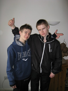
 I also used this image in the contents page, when I created it. I didn't want to use it on the double page spread, as cutting it out was very difficult due to the different angles, and Scott's spiky hair. I eventually reconsidered and put the image on my contents page, although it took me a good hour to cut out the edges. I used this image as I think it works really well to capture the way Drum & Bass is performed, and gives the pair a very cool, aspirational image.
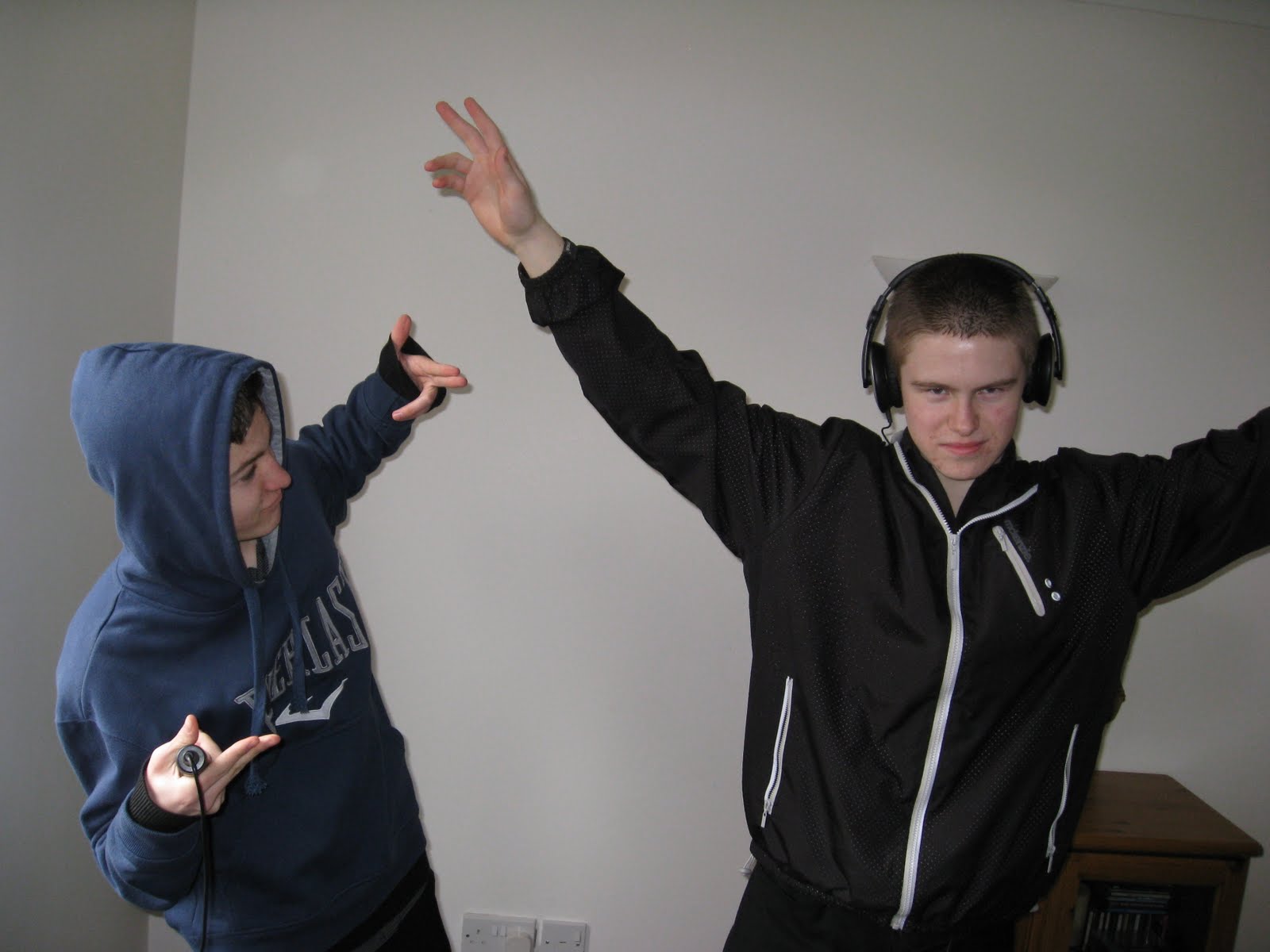
 Although i do like this image, it was pointed out by multiple people that the hand signals look as thought the pair are pointing guns at eachother's heads, which would clash with the pair's friendship described in the interview.
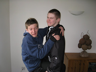
 I didn't like this image, as the angle that the two are standing looks awkward, and the gesture that they are making looks like a strange handshake.
 I was not happy with this mage either, as Scott's face is almost entirely obstructed by his hood.
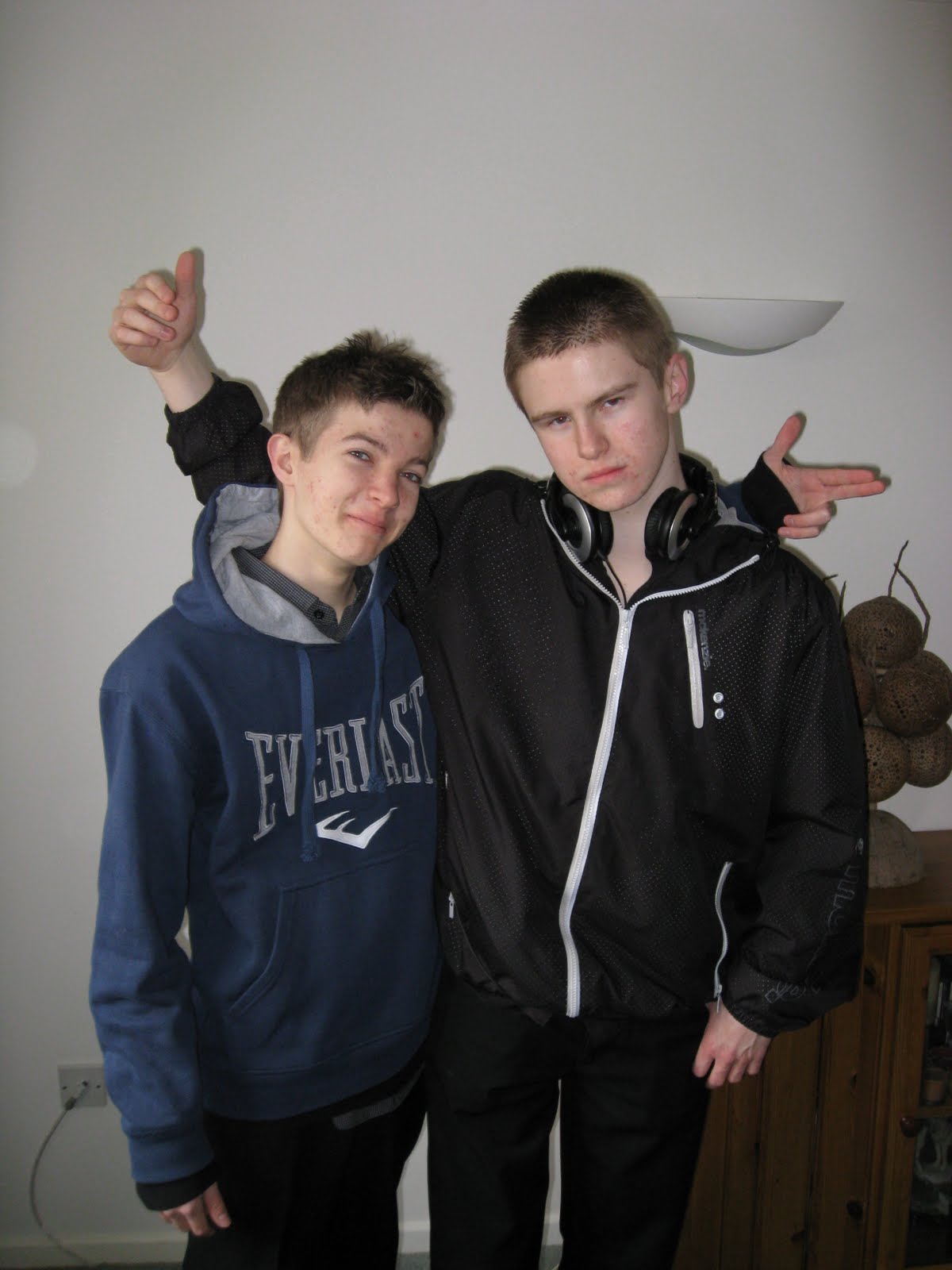
 This is a good image, but i didn't have the room to include it in my double page spread or contents page.
 I eventually used this image for the poster for Sparky's album, which is featured in the interview.
The rest of the images were not used, purely because the pair were messing around when they were taken, but I thought I should put them on anyway.


The rest of the images were not used, purely because the pair were messing around when they were taken, but I thought I should put them on anyway.


Front Cover Photos
All of the following photos were taken under the Rainbow Walk tunnel in South Woodham Ferrers, where Graffiti is allowed, so is in abundance, and allowed me to get a good background for the picture, unlike my student magazine, in which i had to add in graffiti on photoshop. The photo is an image "DJ Sparky," the DJ i made up for the magazine, and I used my friend Ryan to play DJ Sparky in the photos. I used the turntable from the computer game "DJ Hero" for the DJ decs, and brought the table in from my house.


This was another image that was ruined by the flash, and Ryan's expression and pose looks a little bit too haggard, and reminded people of a gremlin like creature. This conflicted with the loud, charaismatic style of Drum & Bass, so i left it out.


The Masthead
I chose the name, "B4ss Lin3" for my magazine, as the Bass line is one of the mot important things in Drum & Bass, and generally the most enjoyed. MCs commonly shout, "here comes the bass line" in the middle of songs, and I felt that if the magazine was name so, it would please my target audience more. I included the numbers for the 4 instead of the a, and the 3 instead of the e, to tie in with modern British cukture, in which manny letters and words are abreviated into numbers, so that they sre simpler to write on a keyboard or mobile phone. By changing the letter around in my masthead, I hope to make the magazine seem more modern, and therefore draw in more readers.

Monday, 19 April 2010


Double Page Spread Design Brief
-The double page spread will be an interview with the fictional DJ, DJ Sparky.
-The interview will concentrate on Sparky's rise to fame, his latest album, what he likes about his stradom, and his views on how Drum & Bass enthusisasts are treated.
-The pages will be split down the middle, with the photographs and text never moving across.
-Each picture will have a black border around the edge.
-Just like the contents page, the background will be plain white, in order to make the text more visible.
-There will be a poster for Sparky's newest album, a photo of him with a group of friends, a picture of him with his MC and another photo, similar to that of the front cover.
-The mode of adress will be friendly and welcoming to the reader, whilst admiring when refering to DJ Sparky.
-There will be large snippets of information taken out of the text, to show the more important parts of the interview. These will be highlighted in alternating blue and green colours, as shown on the front cover and the contents page.
- Just like the contents page, the heading at the top of the page, "New Heights" will have a red background.
Sunday, 18 April 2010
Contents Page Design Breif
-The background of the page will be completely white, with no special effects or colours in the background to get in the way of the writing.
-There will, however, be a black border outlined with red travelling around the outside of the page.
-A large photo of two music artists from the feature article of the magazine standing in a city street, one on a microphone, and one with DJ headphones on will dominate at least half of the page.
-Underneath the photo will be a large heading, in the font "Rockwell," saying "Contents." it will be straight, black text, and won't have any special effects or blending options on it.
-Behind it will be a red border, much like that behind the front cover's plugs, which will be faintly striped red and dark red.
-Under this, there will be a heading saying, "New Heights," the name of the feature article, and underneath that will be a detailed description of the article, with the page number underneath. The font will be "Georgia," as it looks similar to Rockwell, but not as extreme in the sharpened edges.
- The other half of the page will be dedicated to the rest of the magazine's contents, with subheadings for "interviews," ""Albums & Shows" and "Reviews," seperating them out.
-In the bottom right corner will be a small sized text reading, "page 3," and in the bottom left will be the magazine's website adress.
-The page numbers of the contents will be on the left, and to the right will be the description of the content.
-The page numbers will be highlighted in alternating green and blue backgrounds, the same as on the front cover.
- Behind the headings will be a red box, similar to that of the "Contents" heading.
Front Cover Design Brief
-The masthead (B4ss Lin3) will be situated at the top of the magazine, and stretch all along to the right of the magazine.
- The font will be "Rockwell" on the masthead and all other text on the cover, but it will look different, due to the fact that i will use "blending options," to vary the style of the text.
-The masthead will be red, with black boundaries and a shadow around the edge to give it a 3d effect.
- The puff- "the loudest mag in the business," will be situated directly underneath the mashead, and will be a dark colour in order to stand out.
-There will only be one photo on the front cover.
-This photo will feature a male wearing a hooded jumper and playing DJing instruments underneath a tunnel with graffiti on the walls.
-Many of the plugs will be situated underneath a heading the same size and colour of the puff, reading "also featuring," with a list of Drum & and Bass artists underneath that, and to the left of the feature photo, which will be in the centre of the page.
-The headline will be "DJ Sparky gets serious with the mixes," and will be the same style and colour as that of the masthead, yet slightly smaller.
-Tying in with magazine conventions, the bar code will be situated in the bottom rght of the front cover.
-There will be a star shape with the words "free CD" written inside it, slightly above the masthead, in the top right corner.
-All of the plugs will have an alternating blue and green background behind them, of which will be slightly slanted to the left or right.


DJM Contents Page Scan

XXL Contents page scan

IDJ Magazine Front Cover Scan


Saturday, 17 April 2010

Friday, 16 April 2010


International DJ magazine (IDJ)
Very similar in music and style to DJM, International DJ Magazine, or IDJ Magazine, also focuses on Dance, Trance and Electronica, although i could not find any references to Drum & Bass within the magazine, nor any information on it's history online.


DJ Magazine
DJ magazine, or DJM, as it is frequently called, focuses primarily on all types of synthetic music, in particular Dance, Electronica and Trance, and also has small articles dedicated to larger Drum & Bass acts such as Andy C. These genres are not so different from Drum & Bass, as they also rely on DJ instruments, and features artists such as Daft Punk and David Guetta.
The magazine is a lot more specialist than XXL, as it features articles on new DJ decs to buy, suggesting it benefits professional DJs. The magazine was created in 1991 by the editor Ben Murphy, and is released monthly. The magazine has been going for nearly 20 years, so it is fairly established, with copies being translated into Chines, Italian, and even Ukrainian, and calls itself "the worlds largest selling Dance music magazine."
The magazine is a lot more specialist than XXL, as it features articles on new DJ decs to buy, suggesting it benefits professional DJs. The magazine was created in 1991 by the editor Ben Murphy, and is released monthly. The magazine has been going for nearly 20 years, so it is fairly established, with copies being translated into Chines, Italian, and even Ukrainian, and calls itself "the worlds largest selling Dance music magazine."
Subscribe to:
Comments (Atom)